Difference between revisions of "Msc2G5:Group"
(→HOST) |
(→HOST - DEPLOYABLE STAGE) |
||
| (68 intermediate revisions by 3 users not shown) | |||
| Line 1: | Line 1: | ||
__NOTITLE__ __NOTOC__ | __NOTITLE__ __NOTOC__ | ||
| − | =='''HOST'''== | + | =='''HOST - DEPLOYABLE STAGE'''== |
| − | [[File: | + | [[File:Group5 final A1.jpg| 850px]] |
| + | |||
| + | REPORT | ||
| + | http://gsm.hyperbody.nl/images/0/01/HostTEXT.pdf | ||
| + | |||
| + | INTRODUCTION | ||
| + | |||
| + | A stage is a place in a space from which information is transferred to the audience. The typical stage is designed in such a way that it facilitates the information flow with audial and visual support. | ||
| + | |||
| + | The stage is mostly used for presentations and discussions. The use of a stage can be summarised with the following events: | ||
| + | presentation, discussion and (coffee) break. | ||
| + | In these events the information flow changes gradually from a unilateral flow of information to a multifaceted information flow. | ||
| + | |||
| + | The typical stage is well designed to fulfil the presentation event, by providing visual and audial support to the speaker. | ||
| + | The audience has no audial or visual support making it more challenging to communicate during for example a discussion. | ||
| + | |||
| + | The typical auditorium has a clear division between stage and audience, only providing a unilateral information flow. By giving the audience access to audial and visual support we can make the presentation more interactive. | ||
| + | During breaks it should be possible to create your one stage to discuss a topic. In this way stage becomes a place for co-creation of information | ||
| − | + | [[File:Group5 final A2.jpg| 850px]] | |
| − | + | ||
| − | + | ||
| − | + | ||
| − | + | ||
| − | + | ||
| − | + | ||
| − | + | ||
| − | + | ||
| − | + | ||
| − | + | ||
| − | + | ||
| − | + | ||
| − | + | ||
| − | + | ||
| − | + | ||
| − | + | ||
| − | [[File: | + | We've gone through a series of study and investigation, ending up with the three focus: |
| + | |||
| + | 1/ Interactive components | ||
| + | 2/ Ergonomic informed Design | ||
| + | 3/ Deployment & Reconfiguration | ||
| + | |||
| + | INTERACTIVE COMPONENTS | ||
| + | |||
| + | [[File:Group5 final C1.jpg| 850px]] | ||
| + | |||
| + | [[File:Group5 final C2.jpg| 280px]][[File:Group5 final C3.jpg| 280px]][[File:Group5 final C4.jpg| 280px]] | ||
| + | |||
| + | [[File:Group5 final C5.jpg| 850px]] | ||
| + | |||
| + | To give the audience visual and audial support we designed sitting objects with sensors and actuators. The can detect light and sound. Depending on the light conditions or sound conditions of the space the chair can generate different light colors en light intensity. This all depending on the scripts. | ||
| + | |||
| + | [[File:Group5 final C6.jpg| 420px]][[File:Group5 final C7.jpg| 420px]] | ||
| + | |||
| + | The biggest problem during a presentation is that it is mostly a passive activity for the audience. Studies show that after 20 minutes most of the people loose attention. Colors have an influence on our concentration level. Blue and green have a calming effect on the brain and red and yellow activate the brain. Gradually changing the colors of the chairs during the presentation can help keep the attention at a constant level. The chairs will be blue at the beginning of the presentation to calm the audience. After 10 minutes the color will change gradually to red to activate the audience. | ||
| + | |||
| + | [[File:Group5 final C8.jpg| 420px]][[File:Group5 final C9.jpg| 420px]] | ||
| + | |||
| + | During a discussion some people want to participate and express their opinion or ask a question. Most of the people never participate. To have a better representation of the general opinion of the audience its better to get everyones opinion. When their is a vote for a topic or vote for opinion the color of the sitting objects can be changed individually. For example opinion A has a red, opinion B a blue and opinion C a green color. By changing the color of the chair to one of these colors you can express your opinion. The presenter can see in one go witch opinion is the most popular. The color can be changed by blocking the light near the light sensor during a fixed amount of time. | ||
| + | |||
| + | |||
| + | <html><br><iframe width="850" height="478" src="https://www.youtube.com/embed/xC_PSbHwgjo" frameborder="0" allowfullscreen></iframe></html> | ||
| + | |||
| + | [[File:Group5 final C10.jpg| 420px]][[File:Group5 final C11.jpg| 420px]] | ||
| + | |||
| + | Normally the (coffee) break is very chaotic, and people barely get in touch with each other. To stimulate informal discussions and meetings the furniture in the auditorium should not be fixed, and should be light enough to move. Grouping could be stimulated by enhancing visually where the sound comes from. The sitting objects are made of EPS to make them light. During the (coffee) break the sitting objects change colors depending on the sound they detect. In this way its easy to see were the speakers are, thereby situated enhancing the forming of groups. | ||
| + | |||
| + | [[File:Group5 final A4.jpg| 850px]] | ||
| + | |||
| + | [[File:Group5 final A3.jpg| 850px]] | ||
| + | |||
| + | [[File:Group5 final A5.jpg| 168px]][[File:Group5 final A6.jpg| 168px]][[File:Group5 final A7.jpg| 168px]][[File:Group5 final A8.jpg| 168px]][[File:Group5 final A9.jpg| 168px]] | ||
| + | |||
| + | ERGONOMIC INFORMED DESIGN | ||
| + | |||
| + | Our fragment renders a continual, flowing shape which evolves between different functions and spatial configurations. I.e. the lectern develops into a bench, then a floor and concludes to an elevated sitting area. The synthetic shaping procedure of the stage was affected by 3 main parameters: functionality, movement, and ergonomics. Additionally, the design was significantly influenced by the design of the neighbouring groups. The construction consists a concrete cantilever structure which supports the detachable, interactive components on top. These components will interact with the speaker by the embedded interactive system (sensors, arduino and actuators), which enhance the self-sufficient dynamic behaviour and flexibility of the stage. In this manner, the component enhanced the ability of the stage to adjust in different scenarios - transforming from a compact platform to various sitting configurations which can host discussions and other group activities. | ||
| + | |||
| + | DEPLOYMENT & RECONFIGURATION | ||
| + | |||
| + | [[File:Group5 final B1.jpg| 850px]] | ||
| + | |||
| + | [[File:Group5 final B2.jpg| 850px]] | ||
| + | |||
| + | [[File:VORONOI CAVE.jpg| 280px]][[File:VORONOI SKIN.jpg| 280px]][[File:VORONOI LEAVE.jpg| 280px]] | ||
| + | |||
| + | [[File:Group5 final D0.jpg| 850px]] | ||
| + | |||
| + | STRUCTURAL OPTIMISATION | ||
| + | |||
| + | During Workshop 1, we started with exploring the fabrication principle in a smaller scale that we believe the result would inspire the fabrication in larger scale. | ||
| + | |||
| + | The initial idea is to rebuilding the mass from a branching structure, then relate the thickness of the branches with the orientation and functions. In order to optimise the structural performance while minimising the material use, we use Millipede(grasshopper plugin) to analysis the structural performance, and adjust our script according to the result. We planned to fabricate the structure layer by layer, however the resulting inter-crossing structure were very messy, the joinery between different layers are not designed and controlled. As a result, we found it not logical to model the joinery manually for fabrication. | ||
| + | |||
| + | With the previous findings in mind, we developed the cellular concept - Generate the branches by 3 layers of three-dimensional Voronoi cells, with the size and thickness are various according to the structural performance. After that, we also tried to divide the whole geometry in larger cells, and sub-divide them into smaller cells. That the number and density and distribution of subdivision are informed by the structural analysis. | ||
<html><br><iframe width="850" height="478" src="https://www.youtube.com/embed/Sr1u7265Fis" frameborder="0" allowfullscreen></iframe></html> | <html><br><iframe width="850" height="478" src="https://www.youtube.com/embed/Sr1u7265Fis" frameborder="0" allowfullscreen></iframe></html> | ||
| − | [[File: | + | [[File:Group5 final D4.jpg| 850px]] |
| + | [[File:Group5 final D1.jpg| 280px]][[File:Group5 final D2.jpg| 280px]][[File:Group5 final D3.jpg| 280px]] | ||
| − | [[File: | + | [[File:Group5 final D5.jpg| 420px]][[File:Group5 final D6.jpg| 420px]] |
| + | When we look back to the over fabrication, we encountered several structural challenge including the cantilevering part of the design, counterbalancing and the required strength to accommodate the desire function on the stage. We then decided to fabricate the stage in two layers - The structural concrete shell, and the functional EPS layer. | ||
| − | + | Focusing on the structural concrete shell, we combined the previous findings on the layering and cellular concepts, we would like to achieve a more controlled design rather than the computer generated voronoi cells, aiming for more regularity without losing the essence of non-standard, computer aid design process. We decided to rebuild the concrete shell with hexagonal cells, the structural branches within the cells follows the geometry and create a uniform overall impression. Which the mobility of the stage in mind, we also designed the shell to be fabricated by groups of cells. | |
| − | + | The variation of thickness on the concrete shell, size of the cells, thickness of the branches, internal structures within the cells, and the grouping of cells are informed by the structural analysis with the help of Karamba 3-D(grasshopper plugin) and UHPC experts form HI-CON. We related the mentioned parameter with the principle stress, structure deformation and compression-tension analysis, through the back and forth process, optimise the design of the concrete cells. | |
| − | [[File: | + | [[File:Group5 final D7.jpg| 850px]] |
| − | [[File: | + | [[File:Group5 final D8.jpg| 280px]][[File:Group5 final D9.jpg| 280px]][[File:Group5 final D10.jpg| 280px]] |
| − | + | FABRICATION | |
| − | + | Our part of the stage will be constructed from two main materials: EPS and concrete. The EPS will be used to create the components nested in the top layer. These need a coating to protect the EPS from damage. Two different coatings have been tested, one on an epoxy base and the other on a polyurethane base. The components are fabricated by EPS coated with epoxy resin and rubber paint. This elastic coating, which constitutes the finishing layer of the overall construction, is applied in the bottom surface of the modular components and the resting areas of the stage. Thus, this material undertakes a role of comfortable sitting while allowing the components to interlocking the concrete structure through an extrusion of the negative porosity pattern on the hexagonal shell. | |
| + | The epoxy base coating will also serve to prevent the concrete sticking to the EPS in the mould removal process. The first conclusions are that the polyurethane coating is easier applicable, because it is less fluid so it will flow as much, but it has more texture due to the way it is applied. It does smoothen out a less clean surface though. On the other hand epoxy leaves a very smooth surface, but is harder to apply evenly. Mixing it in the right ratio is hard, but very important. Another argument for the epoxy is that glass fiber can be added to gain even more durability. | ||
| − | + | The mould for the concrete exists of three parts: a main mould from EPS, wooden edges and the components to top it off. The main mould consists of branches of coated EPS. To test the minimum thickness for these branches, a working model has been made. This model has branches with a diameter from 40 to 20 mm. These sizes are based on advice from the concrete supplier on structural minimum and to prevent lumping together due to the fibers in the concrete. For now, the mixture doesn't seem to get all the way through into the thinnest parts, but adding more water to the mixture might make it more fluid and thus more able to fill the whole model. | |
| − | |||
| − | [[File: | + | [[File:Group5 final D11.jpg| 850px]] |
| − | [[File: | + | [[File:Group5 final D12.jpg| 850px]] |
| − | [[File: | + | [[File:Group5 final F1.jpg| 850px]] |
| − | + | TOOL-PATH GENERATION | |
| − | [[File: | + | After defining the hexagonal pattern, we can use the volume of an individual cell to mill a mould of EPS in which we pour concrete. The cells need to be light but structural and according to the ergonomics, the top surface needs to be more solid in order to walk or sit on it. So our first direction is a cell of concrete that, as you near the bottom surface, will be more porous. The approach of milling is that we mount the piece of EPS on a robotic arm and program the arm in such a way that the arm moves the EPS according to the position of the fixed drill. In this way we can mill from all the directions except the bottom. Luckily this will not limit the design because of the higher level of porosity at the bottom. For the final result we aim for a straightforward design of the cell that exists out a milling method. So generate the tool paths and not receiving them from an already designed end result. |
| + | |||
| + | The first step is mount the EPS on the robotic arm and use the hot wire cutter to cut away the part of it that is not within the boundary of the cell. Then we can use the tool paths to guide the robotic arm. The principle of the method is using the faces of the boundary in relationship to the cells center. Each evaluated point on the face, according to the distance to the center of the face, will inform the robot a depth it needs to drill. The closer to the center of the face the less deep it goes. So at the corners of the face the drill will reach the maximum length of the cells center. This principle will create a branching structure within the cell. | ||
| + | |||
| + | <html><br><iframe width="850" height="478" src="https://www.youtube.com/embed/j5cL0-3XFEw" frameborder="0" allowfullscreen></iframe></html> | ||
| + | |||
| + | CONCLUSION | ||
| + | |||
| + | After understanding these new approaches of manufactoring, we decide to continue working on the project a little longer. After the Msc2 presentation we will continue according the schedule below. We will improve the scales of macro, meso and micro and after finalising the design we start testing the proces of milling and hot-wire cutting with the robotic arm. When everything is prepared and installed we can manufacture the molds around the end of August. After everything is milled we can start testing the proces of pouring concrete into the eps molds with HI-CON. | ||
| + | |||
| + | [[File:Group5 final G1.jpg| 850px]] | ||
| + | |||
| + | <div style="height:30px; width: 850px; margin:0px; padding: 0px; padding-top: 20px; border: 0px;"> | ||
| + | <div style="float:left; width: 160px; height 30px; border: 0px solid #aaa; margin-right:10px; " align="center"> | ||
| + | <b>Cheung Cheuk Ming</b> | ||
| + | </div> | ||
| + | <div style="float:left; width: 160px; height 30px; border: 0px solid #aaa; margin-right:10px; " align="center"> | ||
| + | <b>Haris Grivokostopoulos</b> | ||
| + | </div> | ||
| + | <div style="float:left; width: 160px; height 30px; border: 0px solid #aaa; margin-right:10px; " align="center"> | ||
| + | <b>Max Kowalski</b> | ||
| + | </div> | ||
| + | <div style="float:left; width: 160px; height 30px; border: 0px solid #aaa; margin-right:10px;" align="center"> | ||
| + | <b>Maxime Selling</b> | ||
| + | </div> | ||
| + | <div style="float:left; width: 160px; height 30px; border: 0px solid #aaa; margin-right:10px" align="center"> | ||
| + | <b>Tijs Niessen</b> | ||
| + | </div> | ||
| + | </div> | ||
Latest revision as of 14:59, 1 July 2016
HOST - DEPLOYABLE STAGE
REPORT http://gsm.hyperbody.nl/images/0/01/HostTEXT.pdf
INTRODUCTION
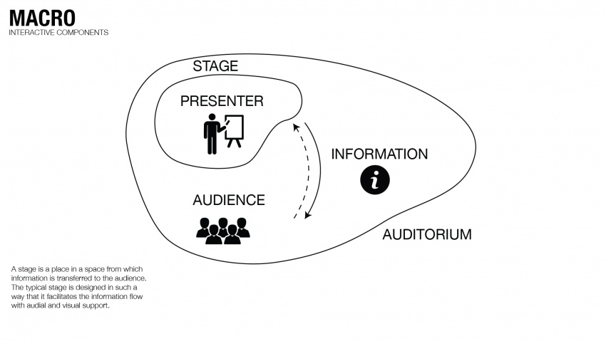
A stage is a place in a space from which information is transferred to the audience. The typical stage is designed in such a way that it facilitates the information flow with audial and visual support.
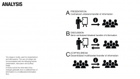
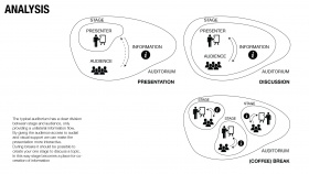
The stage is mostly used for presentations and discussions. The use of a stage can be summarised with the following events: presentation, discussion and (coffee) break. In these events the information flow changes gradually from a unilateral flow of information to a multifaceted information flow.
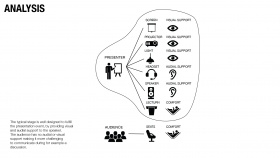
The typical stage is well designed to fulfil the presentation event, by providing visual and audial support to the speaker. The audience has no audial or visual support making it more challenging to communicate during for example a discussion.
The typical auditorium has a clear division between stage and audience, only providing a unilateral information flow. By giving the audience access to audial and visual support we can make the presentation more interactive. During breaks it should be possible to create your one stage to discuss a topic. In this way stage becomes a place for co-creation of information
We've gone through a series of study and investigation, ending up with the three focus:
1/ Interactive components 2/ Ergonomic informed Design 3/ Deployment & Reconfiguration
INTERACTIVE COMPONENTS
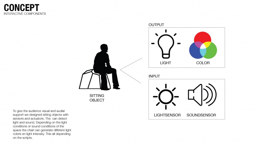
To give the audience visual and audial support we designed sitting objects with sensors and actuators. The can detect light and sound. Depending on the light conditions or sound conditions of the space the chair can generate different light colors en light intensity. This all depending on the scripts.
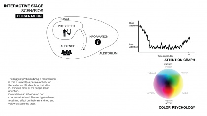
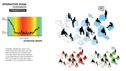
The biggest problem during a presentation is that it is mostly a passive activity for the audience. Studies show that after 20 minutes most of the people loose attention. Colors have an influence on our concentration level. Blue and green have a calming effect on the brain and red and yellow activate the brain. Gradually changing the colors of the chairs during the presentation can help keep the attention at a constant level. The chairs will be blue at the beginning of the presentation to calm the audience. After 10 minutes the color will change gradually to red to activate the audience.
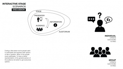
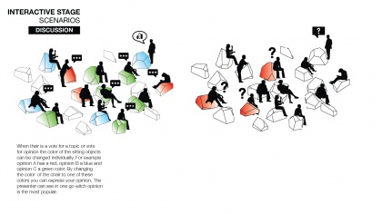
During a discussion some people want to participate and express their opinion or ask a question. Most of the people never participate. To have a better representation of the general opinion of the audience its better to get everyones opinion. When their is a vote for a topic or vote for opinion the color of the sitting objects can be changed individually. For example opinion A has a red, opinion B a blue and opinion C a green color. By changing the color of the chair to one of these colors you can express your opinion. The presenter can see in one go witch opinion is the most popular. The color can be changed by blocking the light near the light sensor during a fixed amount of time.
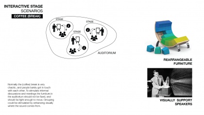
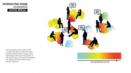
Normally the (coffee) break is very chaotic, and people barely get in touch with each other. To stimulate informal discussions and meetings the furniture in the auditorium should not be fixed, and should be light enough to move. Grouping could be stimulated by enhancing visually where the sound comes from. The sitting objects are made of EPS to make them light. During the (coffee) break the sitting objects change colors depending on the sound they detect. In this way its easy to see were the speakers are, thereby situated enhancing the forming of groups.
ERGONOMIC INFORMED DESIGN
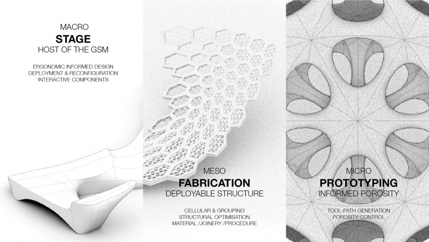
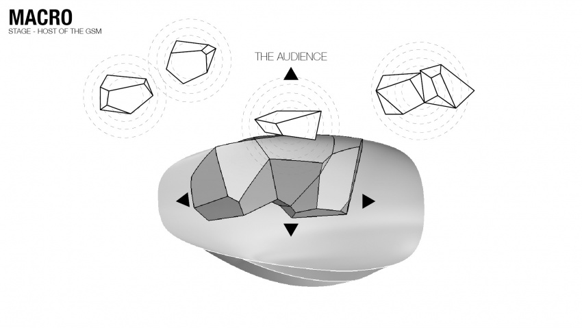
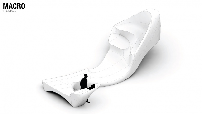
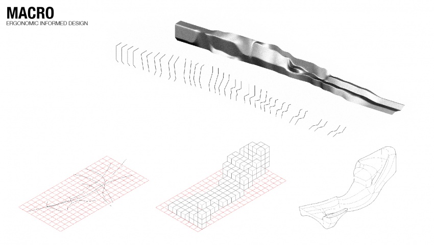
Our fragment renders a continual, flowing shape which evolves between different functions and spatial configurations. I.e. the lectern develops into a bench, then a floor and concludes to an elevated sitting area. The synthetic shaping procedure of the stage was affected by 3 main parameters: functionality, movement, and ergonomics. Additionally, the design was significantly influenced by the design of the neighbouring groups. The construction consists a concrete cantilever structure which supports the detachable, interactive components on top. These components will interact with the speaker by the embedded interactive system (sensors, arduino and actuators), which enhance the self-sufficient dynamic behaviour and flexibility of the stage. In this manner, the component enhanced the ability of the stage to adjust in different scenarios - transforming from a compact platform to various sitting configurations which can host discussions and other group activities.
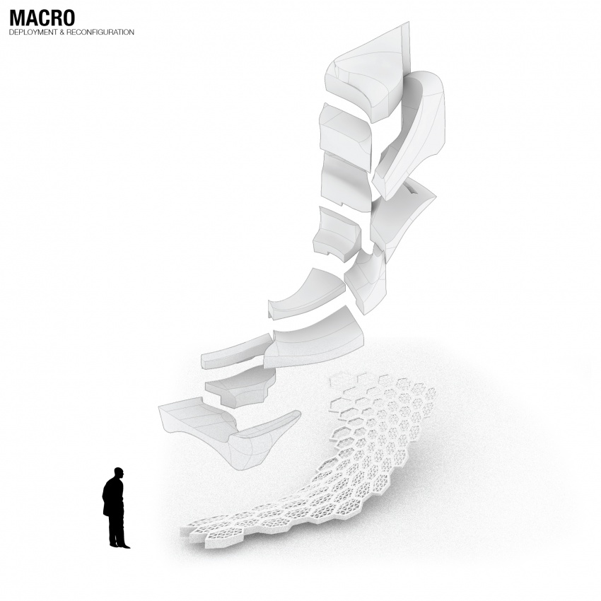
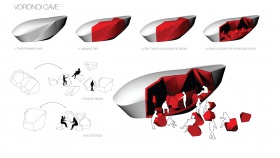
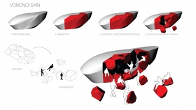
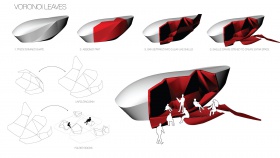
DEPLOYMENT & RECONFIGURATION
STRUCTURAL OPTIMISATION
During Workshop 1, we started with exploring the fabrication principle in a smaller scale that we believe the result would inspire the fabrication in larger scale.
The initial idea is to rebuilding the mass from a branching structure, then relate the thickness of the branches with the orientation and functions. In order to optimise the structural performance while minimising the material use, we use Millipede(grasshopper plugin) to analysis the structural performance, and adjust our script according to the result. We planned to fabricate the structure layer by layer, however the resulting inter-crossing structure were very messy, the joinery between different layers are not designed and controlled. As a result, we found it not logical to model the joinery manually for fabrication.
With the previous findings in mind, we developed the cellular concept - Generate the branches by 3 layers of three-dimensional Voronoi cells, with the size and thickness are various according to the structural performance. After that, we also tried to divide the whole geometry in larger cells, and sub-divide them into smaller cells. That the number and density and distribution of subdivision are informed by the structural analysis.
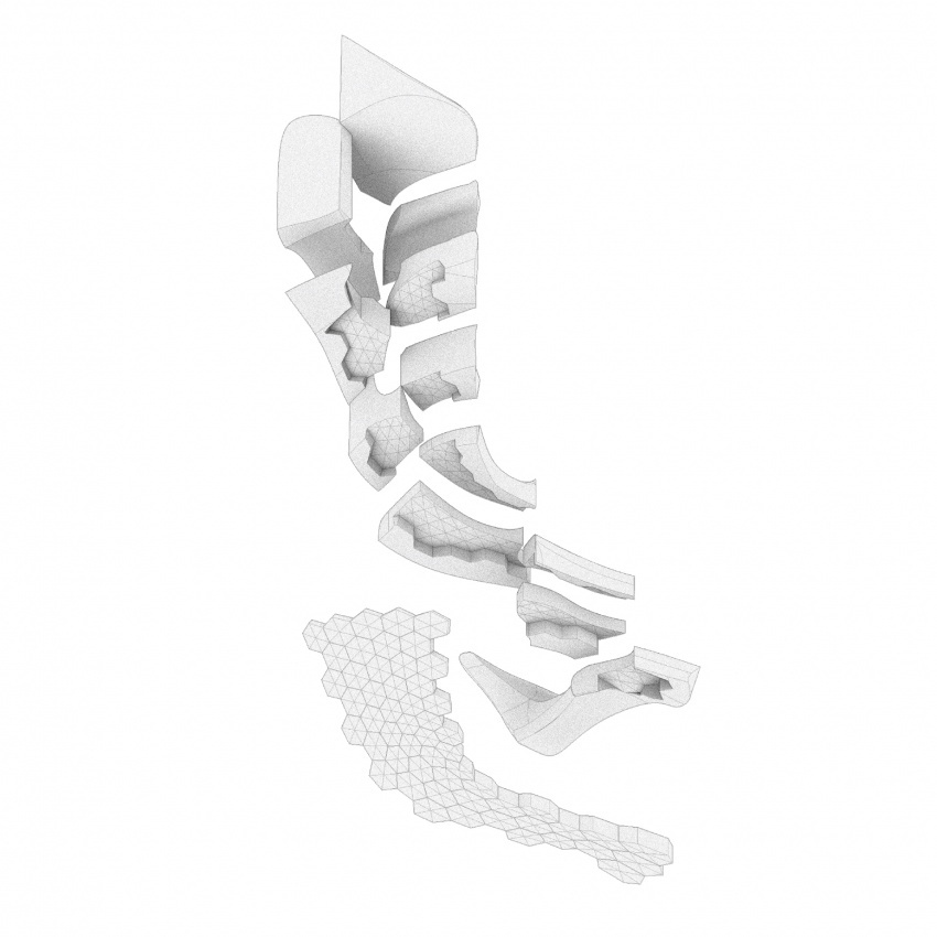
When we look back to the over fabrication, we encountered several structural challenge including the cantilevering part of the design, counterbalancing and the required strength to accommodate the desire function on the stage. We then decided to fabricate the stage in two layers - The structural concrete shell, and the functional EPS layer.
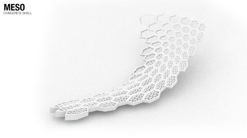
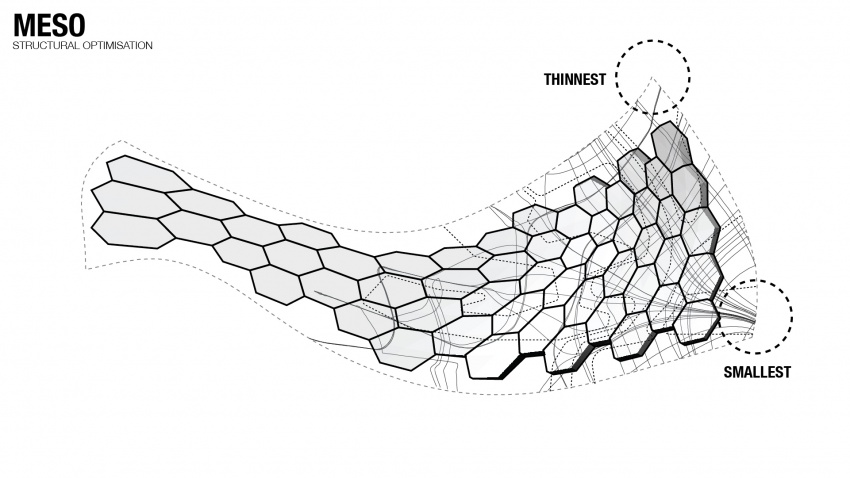
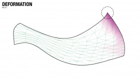
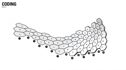
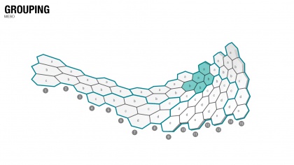
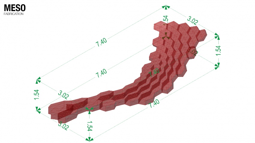
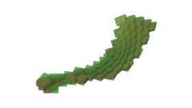
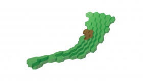
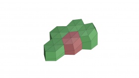
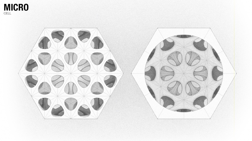
Focusing on the structural concrete shell, we combined the previous findings on the layering and cellular concepts, we would like to achieve a more controlled design rather than the computer generated voronoi cells, aiming for more regularity without losing the essence of non-standard, computer aid design process. We decided to rebuild the concrete shell with hexagonal cells, the structural branches within the cells follows the geometry and create a uniform overall impression. Which the mobility of the stage in mind, we also designed the shell to be fabricated by groups of cells.
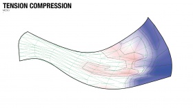
The variation of thickness on the concrete shell, size of the cells, thickness of the branches, internal structures within the cells, and the grouping of cells are informed by the structural analysis with the help of Karamba 3-D(grasshopper plugin) and UHPC experts form HI-CON. We related the mentioned parameter with the principle stress, structure deformation and compression-tension analysis, through the back and forth process, optimise the design of the concrete cells.
FABRICATION
Our part of the stage will be constructed from two main materials: EPS and concrete. The EPS will be used to create the components nested in the top layer. These need a coating to protect the EPS from damage. Two different coatings have been tested, one on an epoxy base and the other on a polyurethane base. The components are fabricated by EPS coated with epoxy resin and rubber paint. This elastic coating, which constitutes the finishing layer of the overall construction, is applied in the bottom surface of the modular components and the resting areas of the stage. Thus, this material undertakes a role of comfortable sitting while allowing the components to interlocking the concrete structure through an extrusion of the negative porosity pattern on the hexagonal shell.
The epoxy base coating will also serve to prevent the concrete sticking to the EPS in the mould removal process. The first conclusions are that the polyurethane coating is easier applicable, because it is less fluid so it will flow as much, but it has more texture due to the way it is applied. It does smoothen out a less clean surface though. On the other hand epoxy leaves a very smooth surface, but is harder to apply evenly. Mixing it in the right ratio is hard, but very important. Another argument for the epoxy is that glass fiber can be added to gain even more durability.
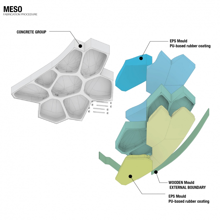
The mould for the concrete exists of three parts: a main mould from EPS, wooden edges and the components to top it off. The main mould consists of branches of coated EPS. To test the minimum thickness for these branches, a working model has been made. This model has branches with a diameter from 40 to 20 mm. These sizes are based on advice from the concrete supplier on structural minimum and to prevent lumping together due to the fibers in the concrete. For now, the mixture doesn't seem to get all the way through into the thinnest parts, but adding more water to the mixture might make it more fluid and thus more able to fill the whole model.
TOOL-PATH GENERATION
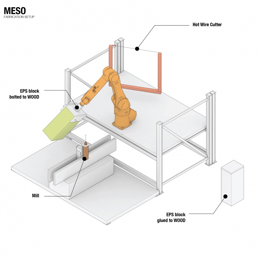
After defining the hexagonal pattern, we can use the volume of an individual cell to mill a mould of EPS in which we pour concrete. The cells need to be light but structural and according to the ergonomics, the top surface needs to be more solid in order to walk or sit on it. So our first direction is a cell of concrete that, as you near the bottom surface, will be more porous. The approach of milling is that we mount the piece of EPS on a robotic arm and program the arm in such a way that the arm moves the EPS according to the position of the fixed drill. In this way we can mill from all the directions except the bottom. Luckily this will not limit the design because of the higher level of porosity at the bottom. For the final result we aim for a straightforward design of the cell that exists out a milling method. So generate the tool paths and not receiving them from an already designed end result.
The first step is mount the EPS on the robotic arm and use the hot wire cutter to cut away the part of it that is not within the boundary of the cell. Then we can use the tool paths to guide the robotic arm. The principle of the method is using the faces of the boundary in relationship to the cells center. Each evaluated point on the face, according to the distance to the center of the face, will inform the robot a depth it needs to drill. The closer to the center of the face the less deep it goes. So at the corners of the face the drill will reach the maximum length of the cells center. This principle will create a branching structure within the cell.
CONCLUSION
After understanding these new approaches of manufactoring, we decide to continue working on the project a little longer. After the Msc2 presentation we will continue according the schedule below. We will improve the scales of macro, meso and micro and after finalising the design we start testing the proces of milling and hot-wire cutting with the robotic arm. When everything is prepared and installed we can manufacture the molds around the end of August. After everything is milled we can start testing the proces of pouring concrete into the eps molds with HI-CON.
Cheung Cheuk Ming
Haris Grivokostopoulos
Max Kowalski
Maxime Selling
Tijs Niessen
